No products in the cart.
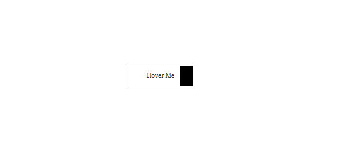
Adding interactive hover effects to buttons enhances the user experience, making websites look more dynamic and engaging. In this tutorial, we will create a modern hover transition button where the background color slides in from the left and slides back when hovered out.
Features of This Button:
✔️ Default black background with white text
✔️ On hover, the white background slides in from the left
✔️ Text color smoothly changes from white to black
✔️ Border remains consistent
Step 1: HTML Structure
We start with a simple <a> tag wrapped around a <span> for better control of the text animation.
<a href="https://modernlisim.com" class="modernlisim-button"><span>Hover Me</span></a>Step 2: CSS Styling
Now, we apply CSS to achieve the sliding effect.
  .modernlisim-button {
    position: relative;
    display: inline-block;
    padding: 12px 38px;
    font-size: 14px;
    font-weight: 400;
    color: white;
    background-color: black;
    border: 1px solid black;
    cursor: pointer;
    overflow: hidden;
    transition: border-color 0.4s;
    text-decoration:none;
  }

  .modernlisim-button:hover {
    color: black !important;
  }

  .modernlisim-button::before {
    content: "";
    position: absolute;
    top: 0;
    left: -100%;
    width: 100%;
    height: 100%;
    background-color: white;
    transition: left 0.4s;
    z-index: 0;
  }

  .modernlisim-button:hover::before {
    left: 0;
  }

  .modernlisim-button:hover {
    border: 1px solid black;
    color: black;
  }

  .modernlisim-button span {
    position: relative;
    z-index: 1;
    color: white;
    transition: color 0.4s;
  }

  .modernlisim-button:hover span {
    color: black;
  }
